
Sunnyside Up
About
Sunnyside Up is a breakfast and brunch concept known for turning everyday menu staples into something more craveable, indulgent, and memorable. As the brand grew, its in-house roasted whole bean coffee became a natural opportunity to express that identity beyond the restaurant and create a more distinctive presence in a crowded all-day breakfast market.
CHALLENGE
Sunnyside Up needed to evolve its brand in a way that felt more ownable, more expressive, and more competitive within an increasingly saturated category. The challenge was not simply to refresh the restaurant’s look, but to define a clearer brand position and bring it to life through a hero product. The whole bean coffee line became that focal point: a branded extension th
APPROACH
We began by repositioning Sunnyside Up around the idea of breakfast as a treat, not just a routine. Rather than softening the indulgent personality of the menu, we leaned into it, building a brand world that celebrated comfort, charm, and a little excess.
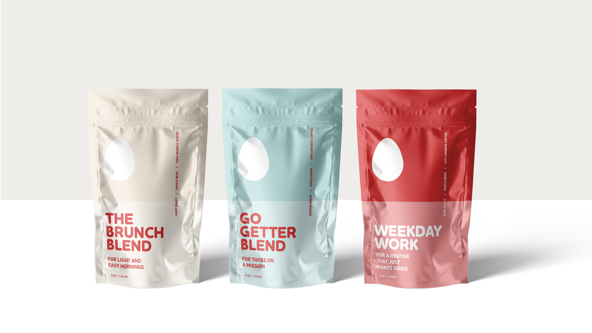
From there, we developed a refreshed identity that balanced polish with play. Clean typography, an elevated color palette, and whimsical visual details helped define a brand voice that felt cheeky, stylish, and instantly recognizable.
The whole bean coffee packaging became the centerpiece of that expression. More than a product label, it served as a concentrated brand moment: a tactile, portable extension of the Sunnyside Up experience. Once that system was established, we expanded the identity across supporting touchpoints including menus, carryout packaging, cups, sleeves, and stickers, creating a cohesive brand presence from shelf to counter to customer takeaway.

Reimagined

Distinctive

Elevated
